

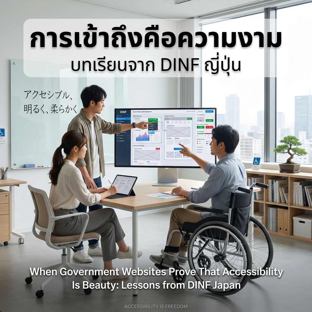
I recently discovered the story of DINF — Disability Information Resources of Japan — and I have to say it filled me with so much hope.
DINF is Japan’s largest disability knowledge hub, bringing together everything from the EU Accessibility Act 2025, DAISY digital talking book standards, CRPD implementation, to accessible broadcasting and communication data. Imagine having one single website that collects everything about disability rights and accessibility in one place — that’s DINF.
But what impressed me isn’t just the content — it’s how they did it.
Recently, DINF was redesigned by Senku Inc. with an approach they call “accessible, bright, and soft.” Even with over 10,000 pages of information! This proves that a large government-supported information platform doesn’t have to look stiff or be hard to use. It can be both a trustworthy resource and beautiful at the same time.
DINF is teaching us that talking about accessibility isn’t enough — we have to show it by example. This is real “walk the talk.”
As a Thai person working in accessibility and equality, I see DINF as a model we should study and adapt — not just at the website level, but in every policy we create. Because accessibility isn’t just a technical standard — it’s design that respects and embraces everyone.
Sources: DINF / Senku Inc.