Have you ever opened a government document and felt like it was written in an alien language? I have. We have all read something and felt lost — not because we are not smart, but because the text was poorly designed.
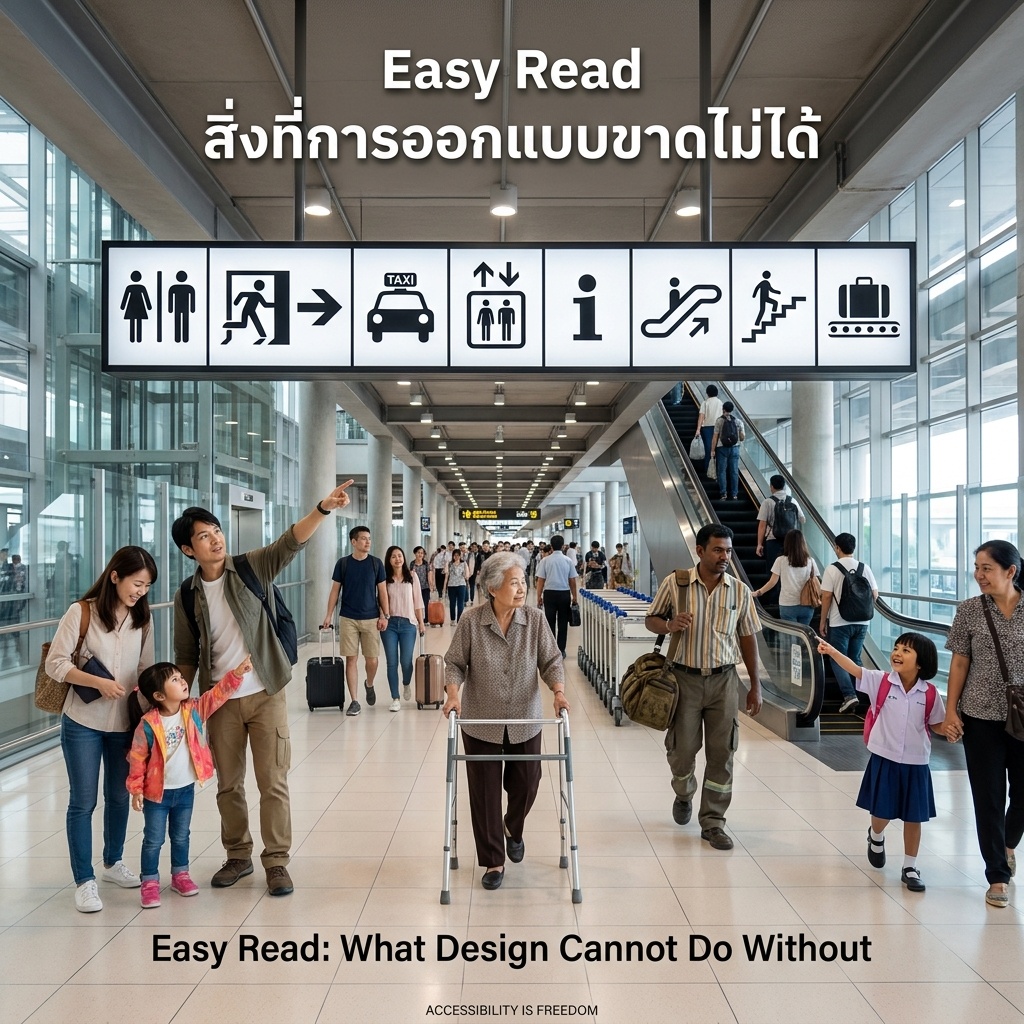
Easy Read is writing that is easy to read and understand. Inclusion Europe created it so people with intellectual disabilities can access important information on their own. But here is the beauty — everyone gets it. Older adults. People learning a new language. Anyone in a hurry. This is the curb cut effect. Design for those who need it most, and everyone wins. A curb ramp was built for wheelchair users. Parents with strollers use it. Travelers with luggage use it. We all benefit.
The rules are simple: plain words, one sentence per line, one idea per paragraph, images for support, no jargon. This is not dumbing down. It is design that respects your time and mine.
Information floods us daily. Easy Read is not a special extra. It is a basic standard we all deserve.
Imagine if health, rights, and benefits all used Easy Read. How many mistakes would vanish? How many better choices would we make? The real question is not who needs Easy Read. It is what we miss without it.
Sources: Inclusion Europe